Client:
Class Project
What I Delivered:
Branding & visual identity
Content creation (photo/ads/promo)
Product concept & prototype
Packaging design
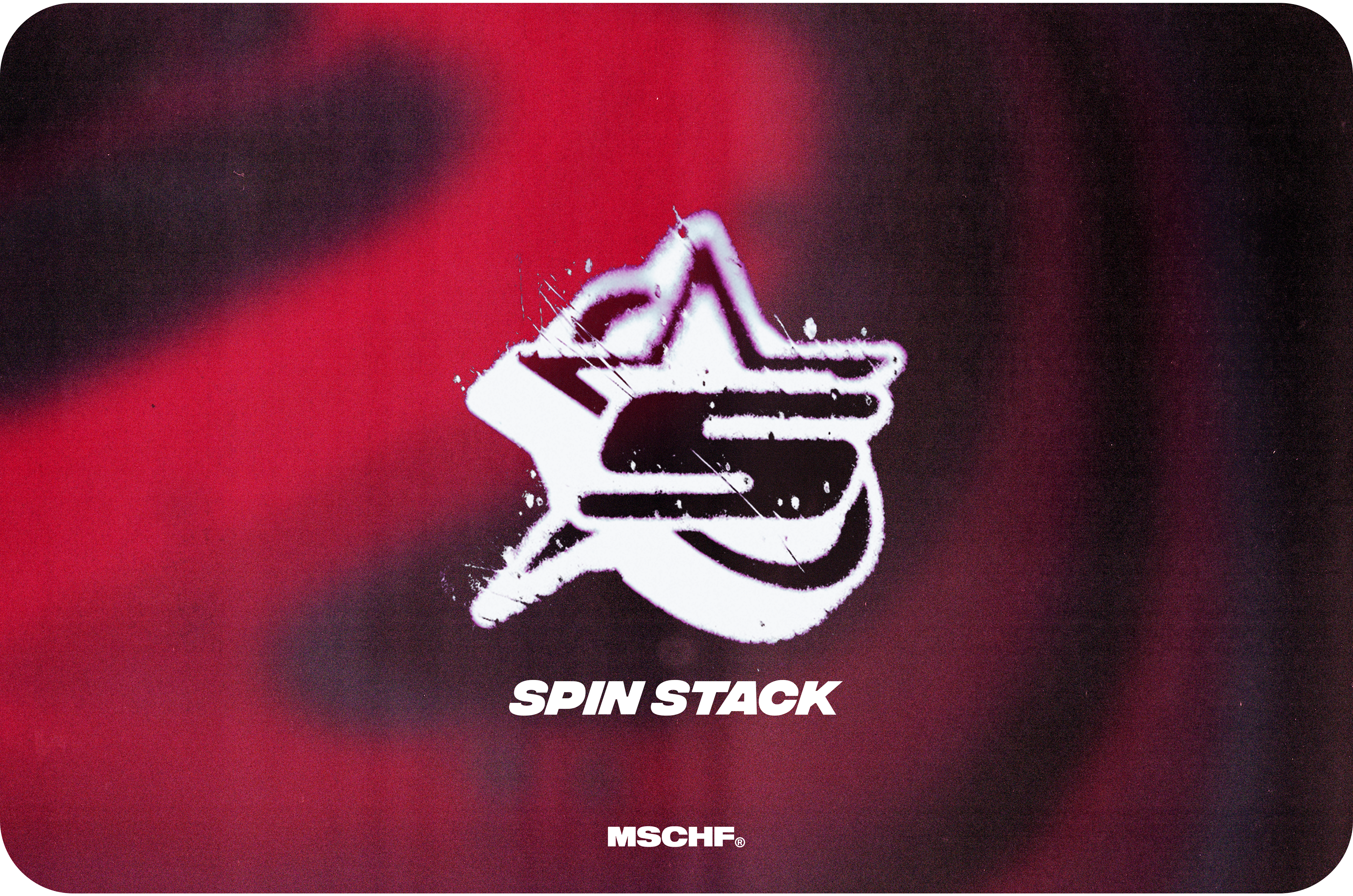
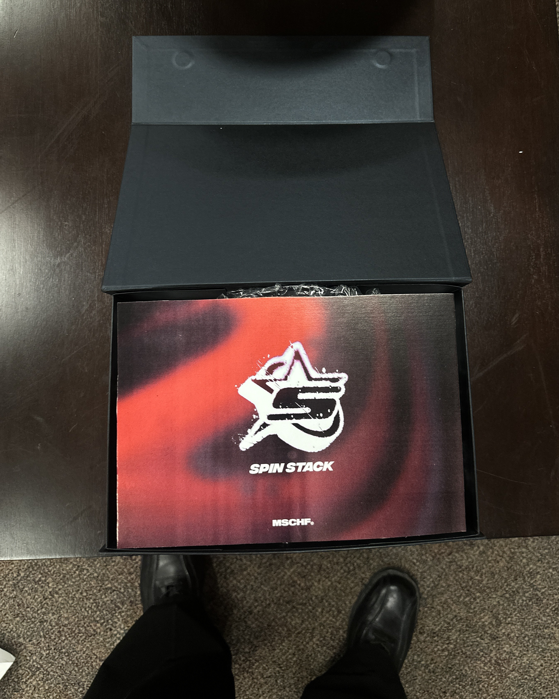
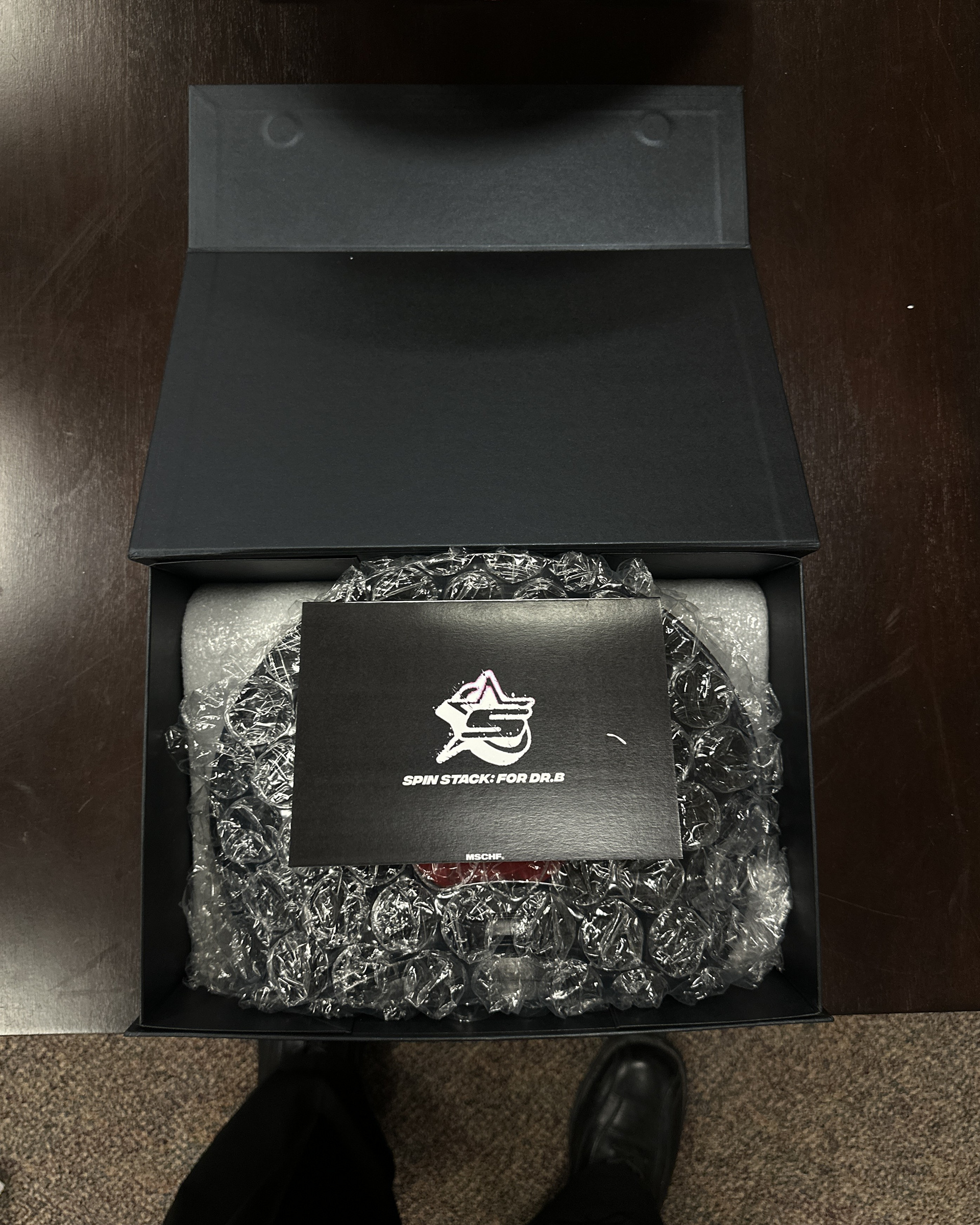
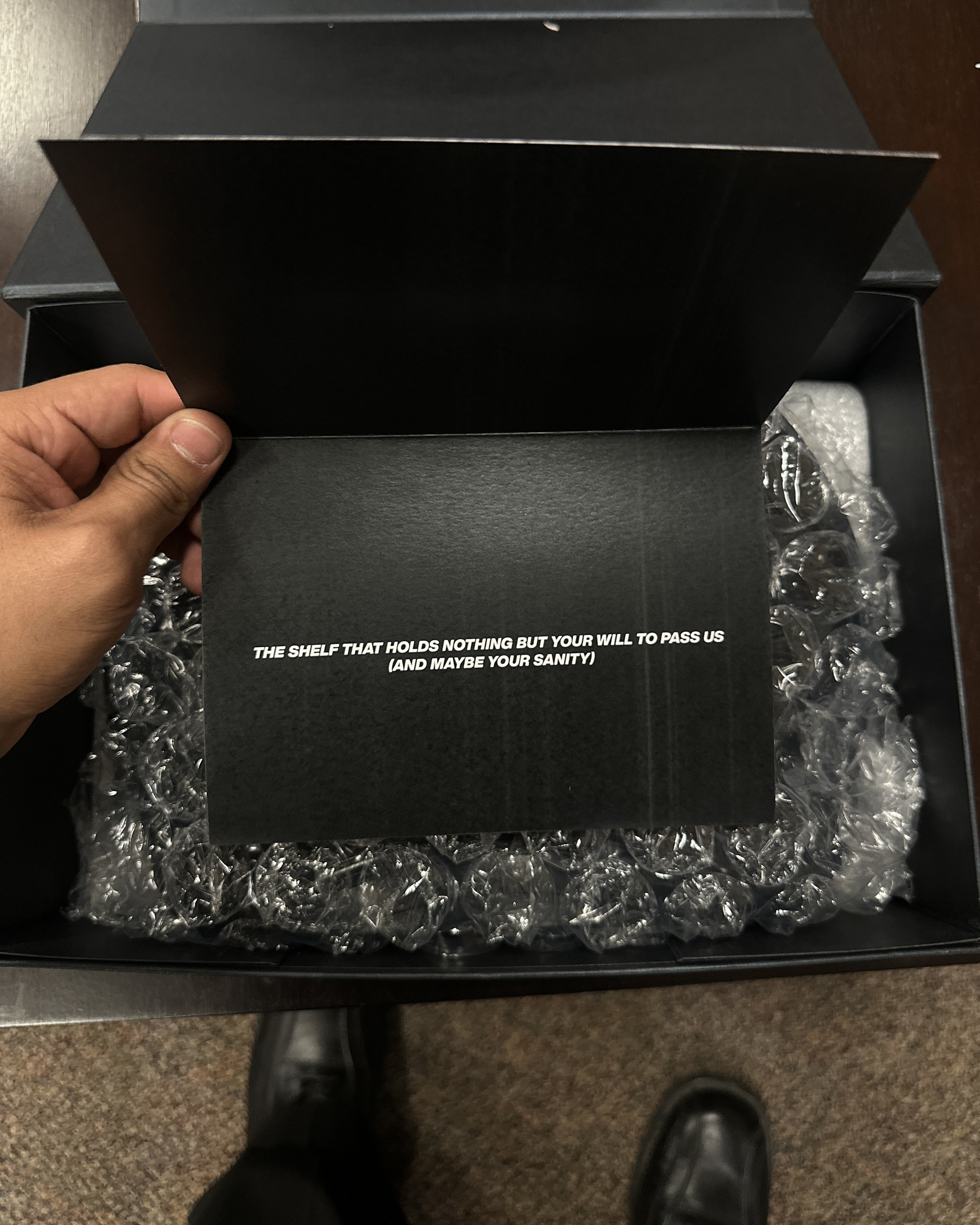
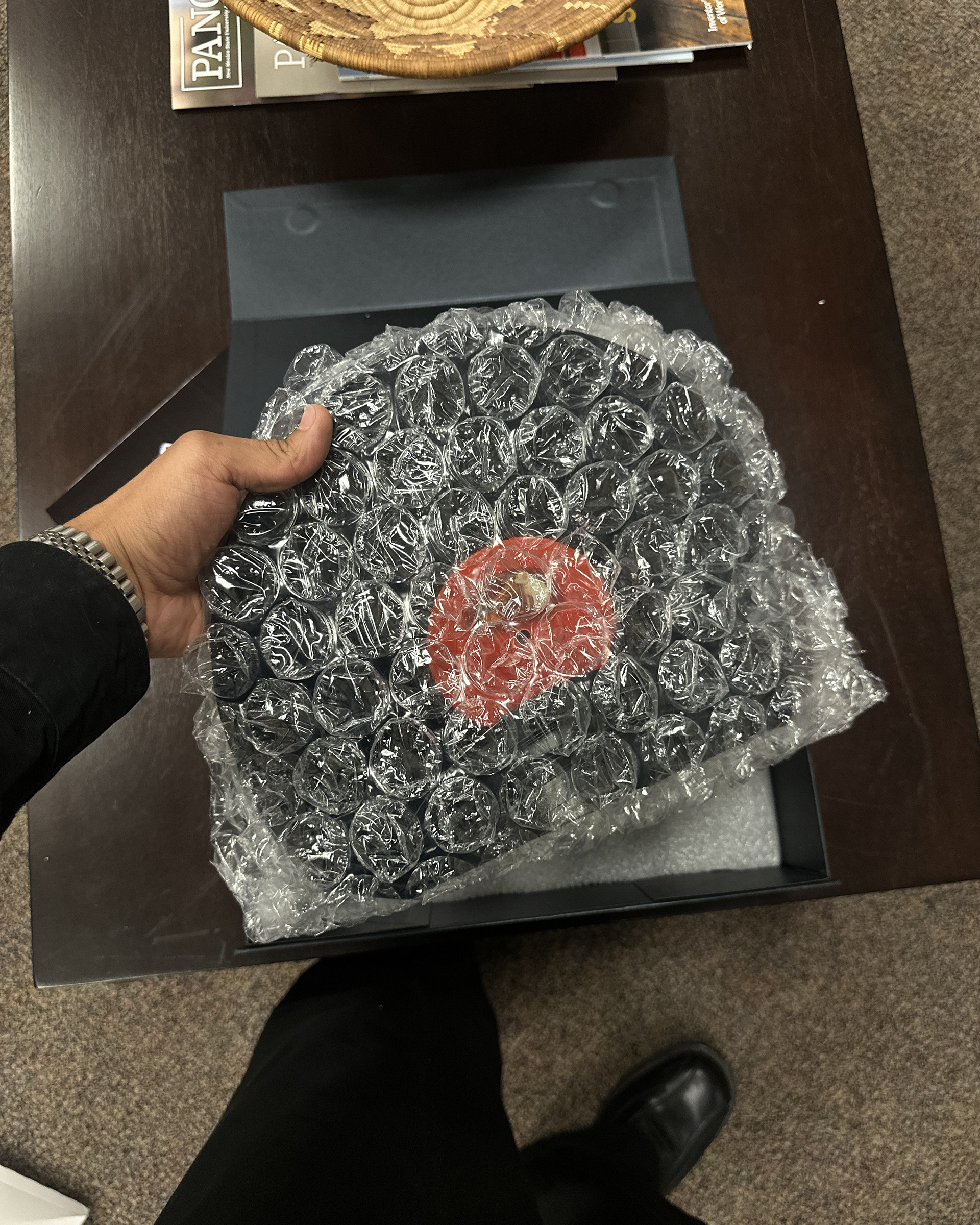
Spin Stack is a limited drop concept made for chaos. A wall-mounted shelf made from recycled vinyl records, designed to be absurd, impractical, and culturally loud.
I led the creative direction, product design, packaging,
and the marketing strategy behind it.
and the marketing strategy behind it.
The Challenge
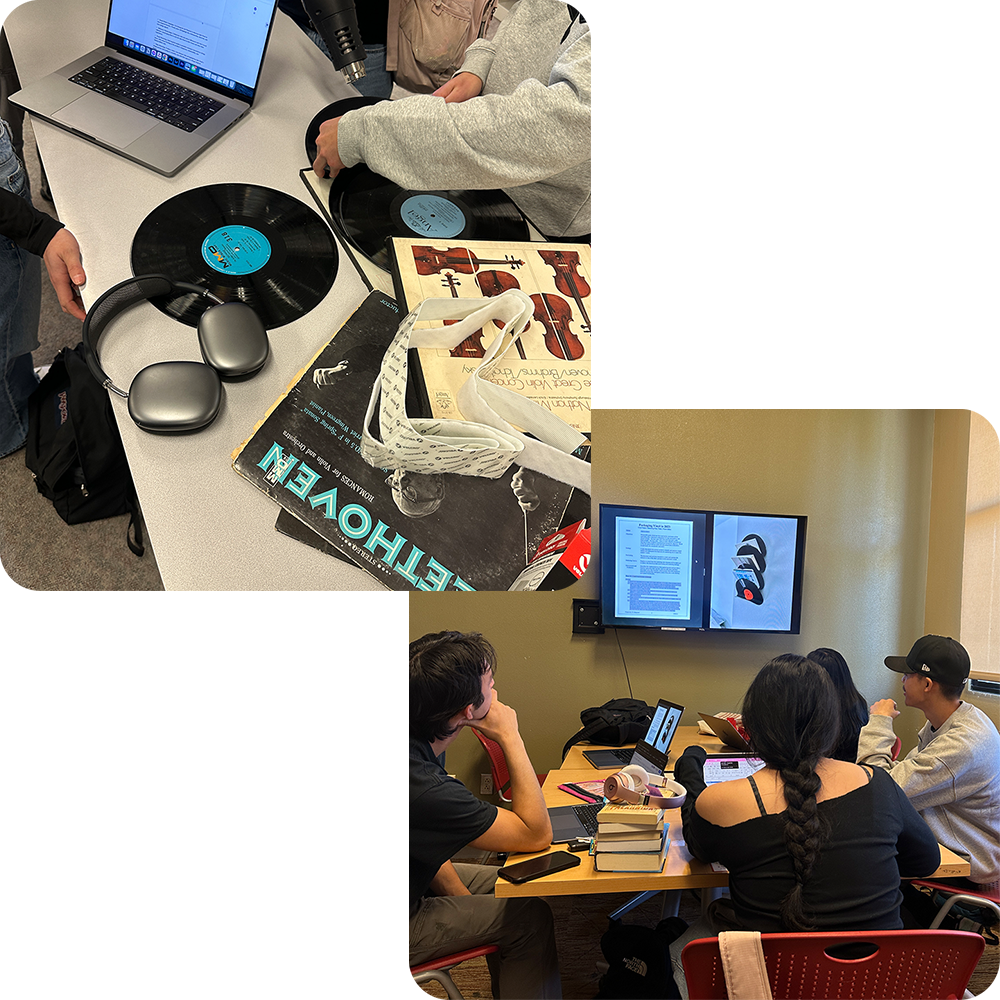
This started as a class project: take an old vinyl record and make something new.
We figured most people would go practical—turn it into a clock, a bowl, something “useful.” We didn’t want that.
Instead, we leaned into the fact that vinyl records are already impractical. So why fight it?
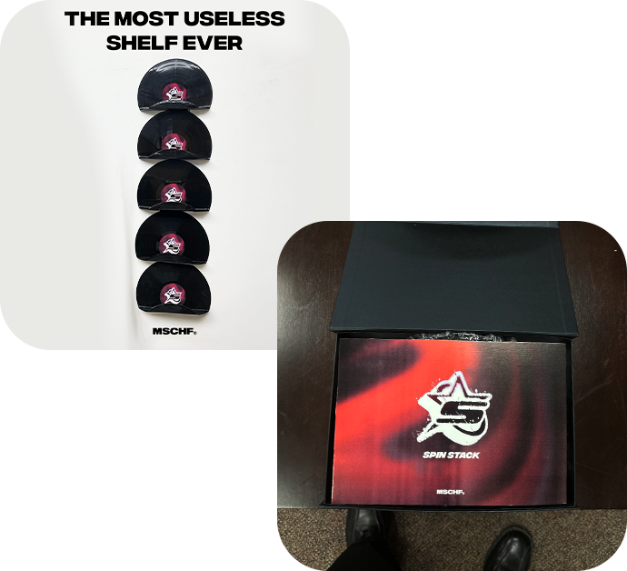
We created Spin Stack, a shelf that’s completely unnecessary, ridiculously limited, and self-aware about how dumb it is—but still looks good doing it.
And that’s the point. It’s not about practicality.
“No one needs this. That’s why they’ll want it.”
Like the Big Red Boots, Spin Stack was designed to start conversations, cause a scene, and sell out purely because it shouldn’t exist.
And yeah… you could actually use it as a shelf. But who cares?
Visual Identity
Mood Board
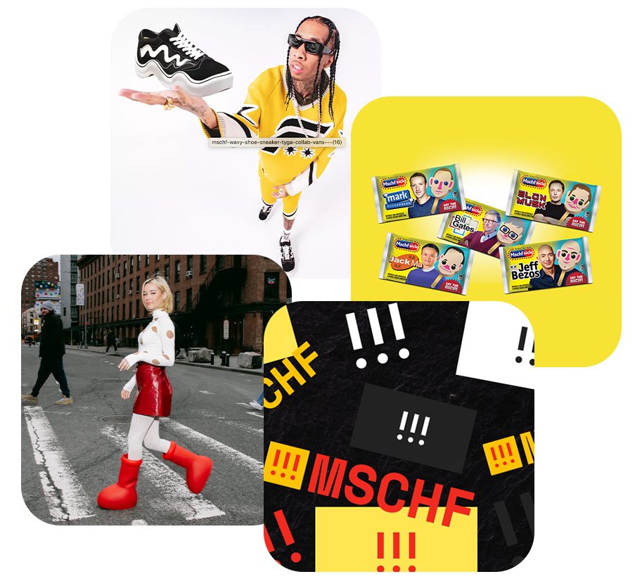
We started by researching MSCHF—the brand, the drops, the tone.
The goal was to understand how MSCHF flips cultural moments into products that spark conversation, even if (or especially if) they seem pointless.
We broke down their:
✔️ Visual language ➝ Grainy textures, raw graphics, loud typography
✔️ Tone ➝ Ironic, self-aware, disruptive
✔️ Product mindset ➝ Hype over utility
✔️ Visual language ➝ Grainy textures, raw graphics, loud typography
✔️ Tone ➝ Ironic, self-aware, disruptive
✔️ Product mindset ➝ Hype over utility
Ideation
Spin Stack’s branding was designed to feel like an instant cultural drop.
✔️ Logo ➝ A graffiti stencil style—raw, quick, no polish
✔️ Colors ➝ Black, white, and danger red. Simple. Aggressive.
✔️ Typography ➝ Bold sans-serif. No fluff.
✔️ Colors ➝ Black, white, and danger red. Simple. Aggressive.
✔️ Typography ➝ Bold sans-serif. No fluff.
Every choice was made to lean into the chaos, own the irony, and cut through the noise.

Execution
We took the identity and applied it across every touchpoint:
✔️ Product mockups ➝ Spin Stack on the wall, looking way cooler than it should
✔️ Packaging ➝ Minimal and self-aware
✔️ Promo content ➝ Social posts, ads, and teasers designed to spark the WTF reaction
✔️ Packaging ➝ Minimal and self-aware
✔️ Promo content ➝ Social posts, ads, and teasers designed to spark the WTF reaction
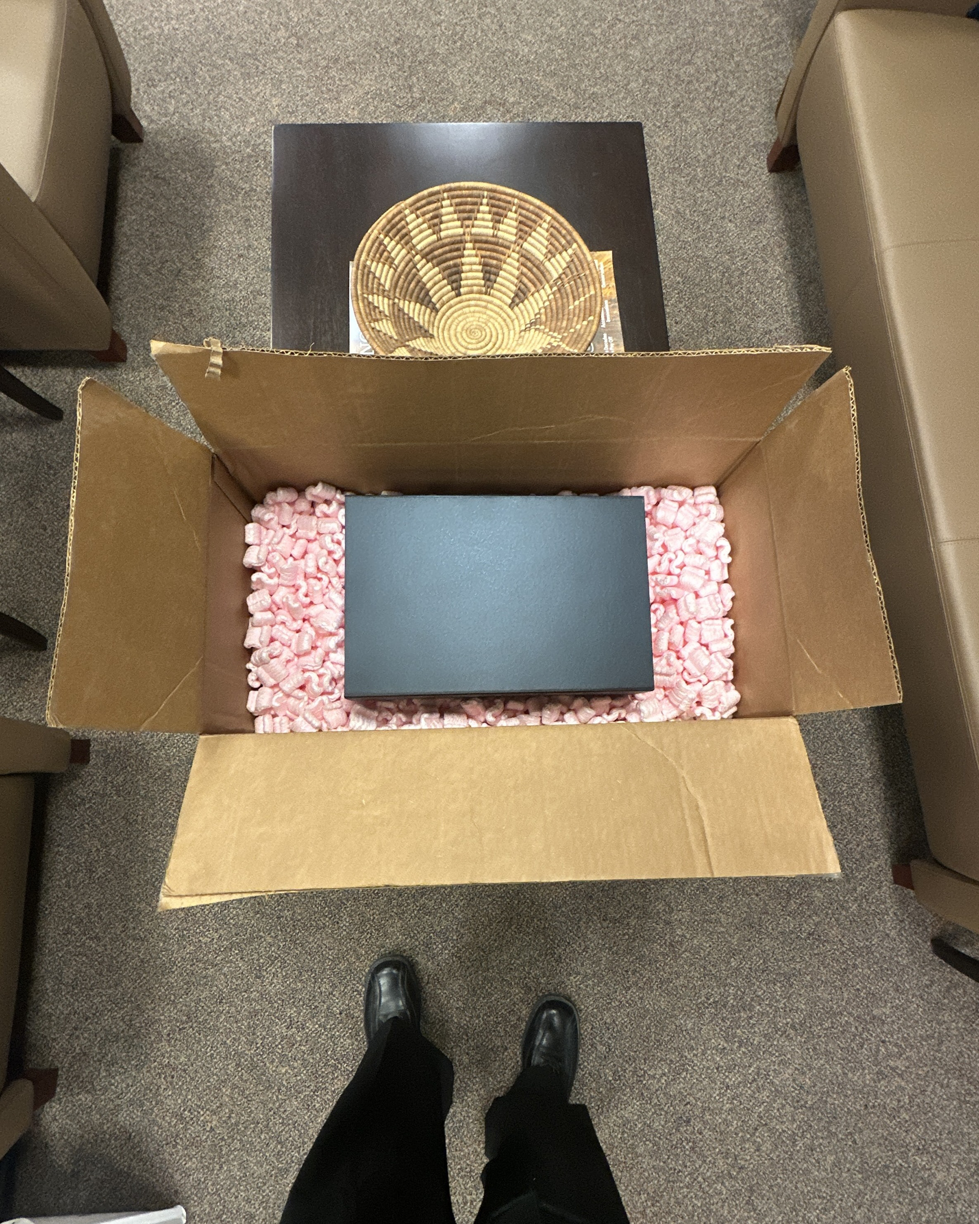
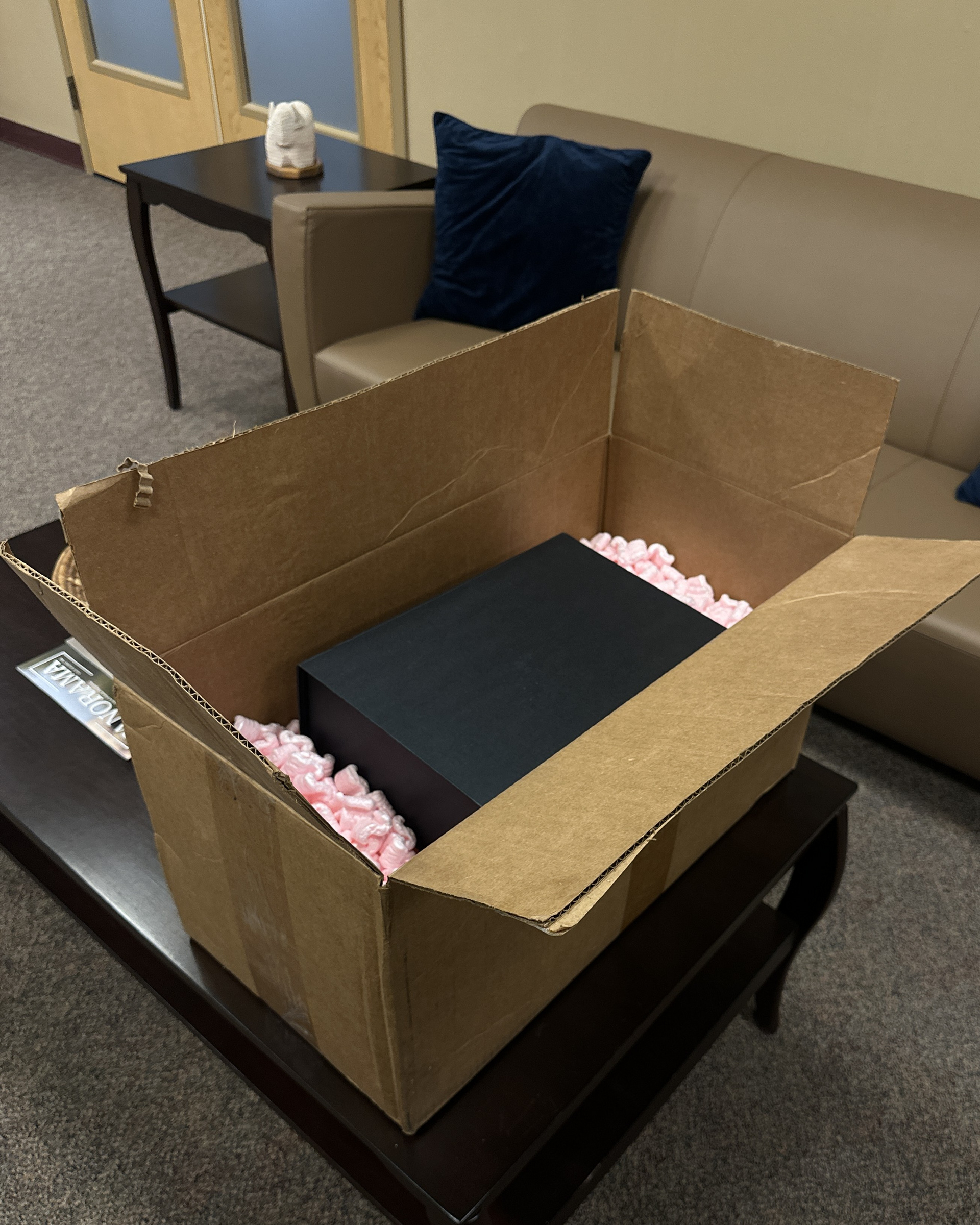
The Product & Packaging
For the final delivery, we decided to take a PR package approach, turning the Spin Stack into a full unboxing experience for Dr. B and for the class to experience along side.
The idea was simple: treat her like an influencer receiving an exclusive drop.
Marketing & Promo
For the promo video, we created a TikTok-style ad that felt more like a viral stunt than a traditional product drop.
✔️ We leaned into current trends—fast cuts, meme references, and chaotic editing
✔️ We mocked influencer unboxings, exaggerating reactions to a shelf no one needs
✔️ We played it dead serious, because that’s how MSCHF wins: by making you question if they’re joking
✔️ We mocked influencer unboxings, exaggerating reactions to a shelf no one needs
✔️ We played it dead serious, because that’s how MSCHF wins: by making you question if they’re joking
Your Brand Deserves More Than Just a Product. It Deserves a Moment.
I help brands and creators build products, content, and moments people have to talk about.